Usability Evaluation
This report is based on the interactive prototype created for Sketching and Prototyping Report, which redesigned the ZotFinder campus navigation app to better support commuter students’ safety, comfort, and route-planning needs. In this updated prototype, users can choose between different route options (such as walking-only versus walk-plus-bus) and see how the overall trip experience would look, including time and segments. The design introduces features such as safety and comfort filters (e.g., “Avoid Park,” “Well-lit Route,” “Shaded Areas”), bus crowdedness indicators, and an optional AR view for orientation, so that users can gain an approximate understanding of how the full journey would feel even though not all features are fully implemented. In this report, I describe the usability evaluation of that prototype, including the evaluation script, the main task given to participants, a summary of their qualitative feedback, the key usability issues identified, and proposed changes to improve the interface.
Hi, thank you for taking the time to participate in this usability study.
My name is Ruilin, and I’m a student in INF 131. I’m doing a short usability study for this class.
(Optional small talk ): “How’s your day going?” / “How’s week 10 treating you?”
You were invited because your experience as a UCI student can help improve a campus navigation app. Today, you’ll be trying out a prototype of a redesigned ZotFinder interface. ZotFinder is a UCI campus map app. This prototype focuses on helping commuter students plan safe and comfortable routes to campus by combining walking, bus information, and route filters.
The session will have two parts: First, a short mini-interview about how you usually get to campus and use navigation apps.
Then, I’ll ask you to perform a few actions using the ZotFinder prototype.
The prototype may look like a real app, but because it’s just a prototype, not everything works. So I’ll give you a specific scenario and guide you through it.
I want to emphasize that I’m not testing you, and I’m testing the design. There are no right or wrong answers. If something is confusing, that means the interface needs improvement. As you work, please think aloud: tell me what you’re looking at, what you’re trying to do, and what you expect to happen.
I’ll be taking notes, but I won’t include your name in the report. The session should take about 15–20 minutes, and you can stop at any time.
Do you have any questions, and are you comfortable continuing?
Task 1: Route customization (safety & environment)
Task 2: Transit choice (real-time bus decision)
Scripts: Imagine you are a commuter student living off campus and heading to an afternoon class at Howard Schneiderman Lecture Hall. Using this prototype, please plan a route from your current location to Howard Schneiderman Lecture Hall that best fits your preferences for safety and comfort.
These are based on the qualitative prompts in the course resource (task + overall feedback).
Task-related feedback:
Overall interface feedback
That’s all the tasks I have for today. Thank you so much for your time and feedback.
Your comments about what was confusing or helpful will inform the next version of this design. I’ll use what you shared to improve how ZotFinder supports route planning and safety preferences.
If you think of anything else later, feel free to let me know. Thanks again, and have a great day!
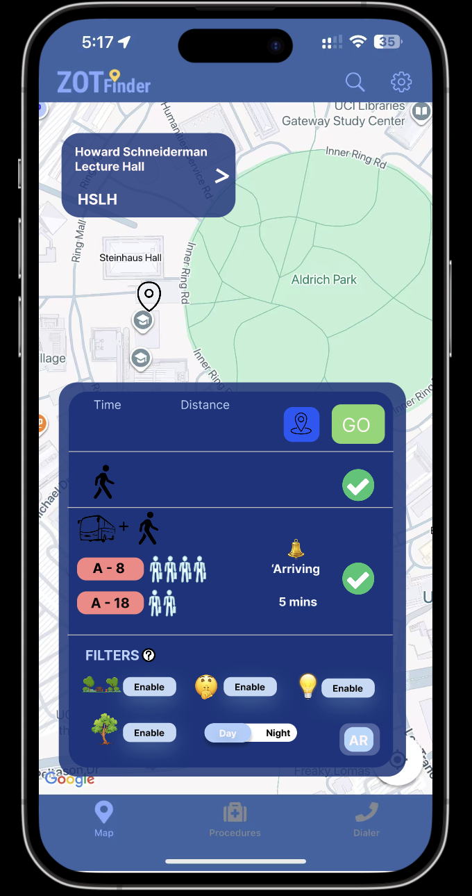
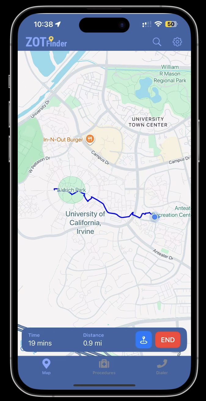
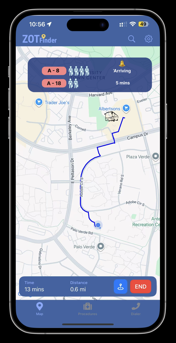
For the main tasks, both participants were able to complete what the prototype asked them to do. They could find and switch between the two route options, one that involved walking only and one that combined walking and the bus, and they were able to choose a route that matched their needs. Then picked the “GO” button to see how the interface would look accordingly and “END” when they wanted to exit. This shows that the basic task flow of noticing that the app offers more than one route, comparing them, and selecting one was clear enough in the interface. Both participants also understood that the filters were intended to shape the route. They could turn options such as “Avoid Park,” “Well lit,” and “Shaded” on and off, and they saw that these settings were related to safety and comfort. At a task level, the core elements required to plan and adjust a route were discoverable and allowed both users to reach a reasonable solution.
At the same time, several aspects of the tasks did not feel smooth. For both participants, the filters section required extra time and close reading before they felt confident about which filters were turned on and which were off. They could manipulate the controls, but it was not immediately obvious from a quick glance which conditions were currently applied to the route. This slowed down their decision making. The bus information also led to uneven understanding between the two participants. The first participant, who had experience with ZotFinder and with TransLoc, could interpret the bus times and crowd icons well enough to conclude that the first bus looked too full. The second participant, who rarely uses ZotFinder, had to guess the meaning of the bus numbers and the small person icons and was not sure how real time or reliable this data was. Because of this, he could not fully trust the bus information when performing the task. Overall, the interface supported basic route selection and customization, but the clarity of filter states and the meaning of the bus details needs improvement so that the tasks feel more immediate and intuitive for users with different levels of experience.
From an overall interface perspective, both participants commented that the general layout made sense to them. They could see route options in one area, filters grouped in another area, and bus information in a separate section, and this structure helped them understand what part of the screen to look at for each type of decision. However, both also noted that, because this was their first exposure to this particular redesign, it took them time to interpret the meaning of specific controls and icons. This suggests that while the high level organization of the interface is clear, the finer details of how information is presented and labeled are not yet as self explanatory as they could be.
Both participants were fourth year UCI undergraduate students who live off campus and commute regularly, but they came to the evaluation with different levels of experience using ZotFinder and transit apps. The first participant was an experienced ZotFinder user and had also used TransLoc before. She quickly understood the basic structure of the redesigned interface and moved through the tasks with relatively little hesitation. When asked to plan a route, she chose to walk to Howard Schneiderman Lecture Hall and used the filters to remove routes she did not want. She described the filters as a way to “filter out the routes I do not want,” and she was able to apply conditions such as avoiding certain areas and then select the remaining route that fit her schedule and comfort level. She relied on the time and distance information on the route cards to understand the overall trip duration and liked that she could compare options without doing extra calculations. In the bus section, she used the times and crowd icons to judge that the first bus looked quite full and that she did not have enough time to wait for a later one, so she decided to walk instead. She said she liked having bus information in the interface and found the small person icons clear and visually appealing. At the same time, she commented that the Day and Night toggle felt unnecessary because preferences like wanting a well lit or quiet route were already covered by other filters, which made that toggle feel somewhat redundant.
The second participant had barely used ZotFinder before and behaved more like a novice encountering the system for the first time. He also successfully completed the tasks, choosing the combined walk and bus route, but he spent a longer time simply looking at the screen and trying to interpret what each section and control meant. He eventually realized that the filters and buttons were interactive, yet he did not quickly understand what each filter would change or how the route options, filters, and bus information were connected. The bus section was especially challenging for him. Unlike the first participant, who could draw on previous experience with TransLoc to interpret the crowd icons, he said he was not sure what the bus numbers and small person icons were meant to show about real time capacity. He needed extra time to guess the meaning behind these visuals and did not feel very confident in using them to decide whether to board the next bus or wait. Together, their feedback suggests that the design works fairly well for experienced users who already understand transit style displays, but it does not yet offer enough built in guidance or clarity for users who are new to ZotFinder or to bus capacity visualizations.
For this evaluation, I used a four-level severity scale:
1 = Cosmetic, 2 = Minor, 3 = Major, 4 = Critical.
No critical issues (4) were observed; most fell between minor and major.
Issue A: Interface assumes prior familiarity with ZotFinder
Issue B: Uneven understanding of bus information and real-time capacity
Issue C: Time needed to interpret filters and customization controls
Issue D: Filter state visibility and redundancy of the Day/Night toggle
The following changes are directly tied to the issues above and are designed to make the interface easier to interpret on a first use, while still supporting experienced ZotFinder users.
Change 1: Strengthen filter state visibility and clarify roles of filters vs. Day/Night
This change addresses Issue C and Issue D.
The Filters section should more clearly indicate which options are active. Active filters could appear as filled pills with bold text and a small checkmark, while inactive filters remain outlined and lighter. This would allow users to quickly scan and see which conditions are shaping the route, instead of having to inspect each label. In parallel, the role of the Day/Night toggle should be clarified or simplified. One option is to remove it and rely entirely on the filters for safety and comfort preferences. Another option is to make it a preset that turns on relevant filters (for example, “Night” automatically enabling “Well-lit” and “Avoid Park”) and briefly explain this behavior. These changes are adequate because they directly reduce the time users spend interpreting controls, make the active state of the route more transparent, and avoid overlapping controls that may confuse users about what actually changes the route.
Change 2: Add explicit explanations for bus information and real-time capacity
This change addresses Issue B.
To support users like Participant 2, who do not come in with prior TransLoc or transit-app experience, the bus information should explain its meaning more explicitly. A short label or legend could clarify that the stick-figure icons represent real-time or near real-time bus capacity and that more figures indicate a more crowded bus. A brief phrase near the times, such as “Live arrival time” or “Estimated arrival,” would clarify how current the timing is. This change is adequate because it removes the need for users to guess what the icons and times mean, brings users with less experience up to the same understanding that Participant 1 already had, and directly supports the task of deciding whether to board the next bus or wait for another.
Change 3: Provide light, first-use guidance for the overall layout
This change addresses Issue A and supports Issue C.
To reduce the assumption of prior familiarity, the interface can include very lightweight guidance for first-time use. For example, a short inline hint near the Filters section, such as “Use filters to customize your route based on safety and comfort”, and a small label near the routes like “Compare route options” would help users quickly understand what each area is for without requiring a full tutorial. Because both participants mentioned that it took them some time to interpret the controls on first use, these small, targeted hints are adequate: they reduce initial confusion, shorten the learning curve, and still keep the interface clean for repeat use.
Together, these changes respond directly to the issues observed in the sessions. They focus on making states and meanings more legible, rather than adding new features, so they are well aligned with the kinds of confusion participants actually experienced during the evaluation.