Sketching and Prototyping Report
This report builds on the findings from Contextual Inquiry, where it was conducted to evaluate students’ real-world experiences using ZotFinder for campus navigation. In that assignment, usability challenges were identified not in the accuracy of the map itself, but in the lack of features supporting students’ safety preferences, comfort needs, and travel decision-making. The inquiry showed that students often have to switch between multiple tools to compare walking and bus options, avoid uncomfortable pathways, and locate quiet spaces once they reach campus. Building on those insights, this report presents a persona-driven redesign and interactive prototype for the ZotFinder interface. The redesigned interface focuses on giving users more control over how they navigate, not just which building they go to.
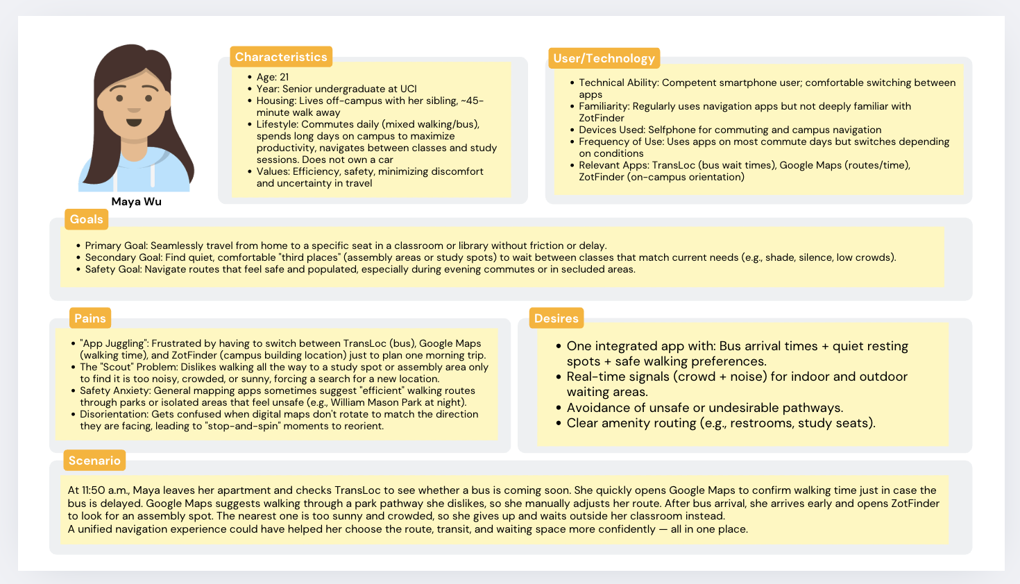
The demographics and lifestyle characteristics of “Maya Wu” are a composite based on the contextual inquiry data from both participants. Maya’s status as a senior living off-campus with a 40-minute commute is derived directly from Participant 1, who represents commuters lacking convenient transit options. The value placed on efficiency and safety is drawn from Participant 1’s decision to avoid walking through William Mason Park at night due to safety concerns and her preference for car routes with wider roads. The technology usage profile reflects the behavior of both participants: Maya’s high familiarity with Google Maps and TransLoc comes from Participant 1’s reliance on these tools for commute planning, while the moderate familiarity with ZotFinder reflects Participant 2, who used it primarily for on-campus orientation and had to spend time learning the interface.
The goals and pains section is grounded in the specific frustrations observed during the inquiry. The “App Juggling” pain point is based on Participant 1, whose biggest challenge was stitching together multiple tools like TransLoc and Google Maps to manage her journey. The “Scout Problem” and safety anxiety are directly supported by observation notes: Participant 1 physically visited an assembly area only to find it too sunny and crowded, while Participant 2 wandered multiple floors of the Science Library searching for a quiet seat because the app lacked occupancy data. The pain of disorientation comes from Participant 2, who stopped to reorient herself because the Zot Finder map did not rotate to match her facing direction.
The specific desires listed in the persona are direct requests recorded in the follow-up interviews. The desire for “One integrated app” with bus and safety data comes from Participant 1, who explicitly wished for an integrated version of ZotFinder that combines TransLoc features and crowd indicators. The request for “Real-time signals (crowd + noise)” is based on Participant 2, who stated this feature was “super important” for her daily routine , as well as Participant 1’s desire to avoid disturbing others. Requests for amenity routing, including restrooms and alternative study spaces, emerged from both participants’ frustrations with unavailable or unclear seating options. Finally, the scenario is a synthesis of Participant 1 arriving early for class and Participant 2’s goal of finding a study spot during a high-density time, illustrating the need for the data-driven decision-making the user desires.
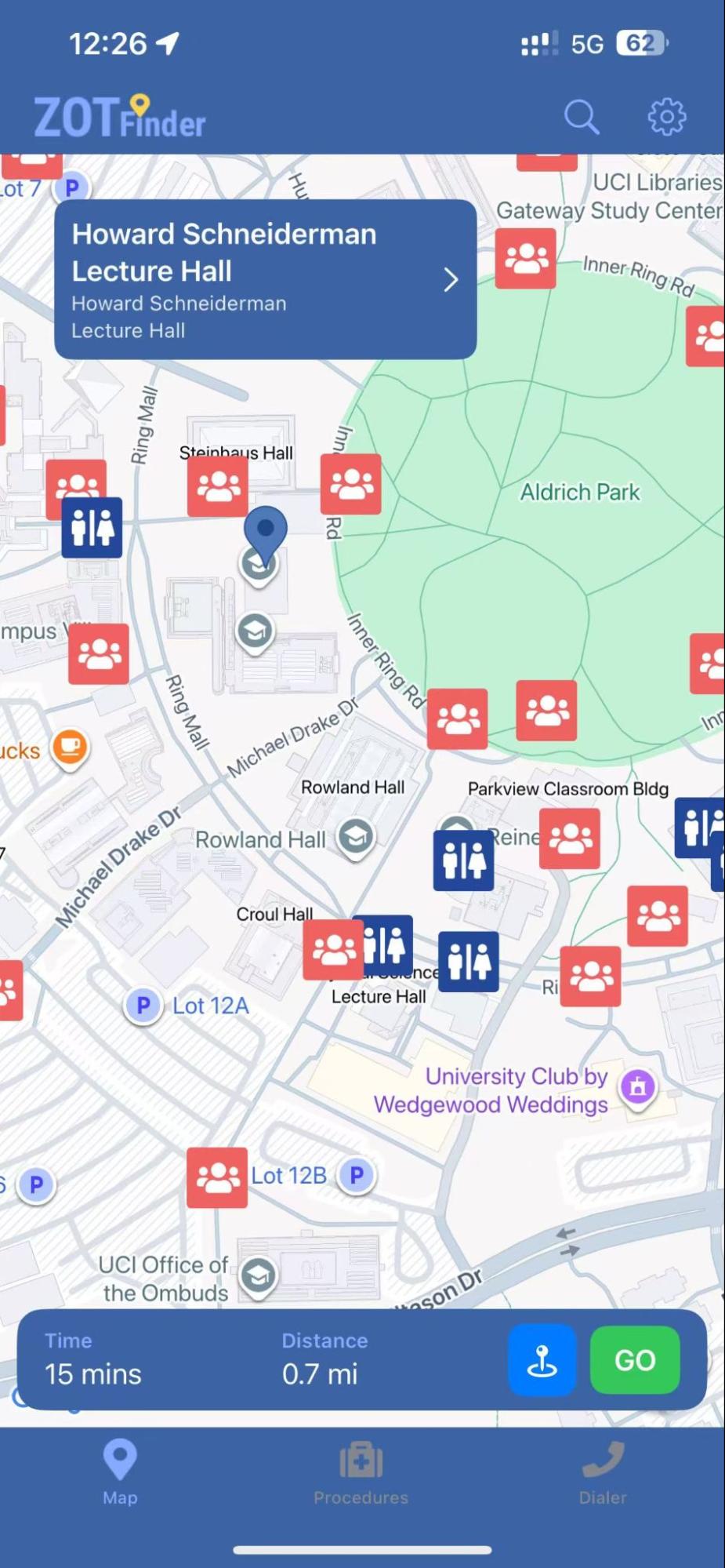
The current ZotFinder design already does several things well. The map clearly marks assembly areas in red and restrooms in blue, giving users a quick overview of where they could wait, meet classmates, or find basic amenities near the destination. The bottom bar shows estimated time and distance to the selected building, which gives a basic idea to estimate and also supports some basic need for punctuality. For basic wayfinding, this interface is functional and informative.
However, it fails to meet commuter students like Maya’s deeper needs. ZotFinder only generates one walking route, with no alternative transportation options or route variations. Maya cannot view or compare bus options, see arrival times, or evaluate whether a combined bus and walking route might be safer, quicker, or less stressful during crowded commute hours. If the walking path is uncomfortable, for example if it is too sunny, unsafe at night, or passing through areas she wants to avoid, there is no built-in option besides walking anyway. In addition, the app provides no way to customize routes based on personal needs, such as avoiding parks at night, finding shaded sidewalks during hot afternoons, or choosing well-lit paths. Because the current design offers limited information and no route preferences, users are often inconvenienced and must switch between multiple apps (like Google Maps and TransLoc) or rely on other tools entirely to plan a commute that actually fits their needs. This gap between the app’s logic and Maya’s lived experience is the primary friction point this redesign aims to resolve.
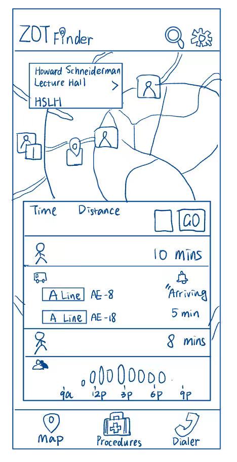
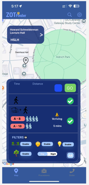
This redesign supports Maya’s need to travel efficiently and avoid unnecessary uncertainty during her commute. Unlike the current ZotFinder design, which shows only a single walking estimate, this interface automatically provides a complete route breakdown, showing the full journey from her current location to the classroom. The display includes the initial walking segment from home or bus stop, the real-time arrival status and crowd level of the bus, and the walking time after being dropped off near the destination. This means Maya can evaluate the entire travel experience without switching between apps or trying to mentally piece together bus schedules and walking distances.
The unique aspect of this sketch is the multi-step route preview that automatically combines walking and bus travel into one unified view, without requiring the user to choose route preferences first. This directly addresses Maya’s need for predictability; she can immediately see whether it makes sense to wait for the bus or walk the whole way based on time, distance, and comfort factors like bus crowdedness. The inclusion of a simplified icon for “bus crowdedness” helps Maya avoid uncomfortable or packed vehicles, further reducing travel anxiety and wasted time.
Additionally, this sketch introduces a time distribution graphic for crowd levels throughout the day, which helps Maya choose when to arrive to better handle the crowd and if she needs to go somewhere else to wait. This supports her need to check whether to find a quiet and comfortable “third place” before class. This design is inspired by Google Maps’ busyness feature for restaurants.
Because the route preview shows the whole process, this supports Maya’s personal goal of seamlessly navigating to class while minimizing discomfort, uncertainty, and decision fatigue. By giving her detailed, automatic route information tailored to how she genuinely travels, this redesign turns ZotFinder into a real planning tool rather than a static map.
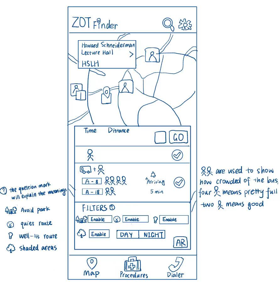
This redesign addresses Maya’s need for safe and comfortable travel options rather than simply the fastest route. Maya wants to avoid crowded buses, uncomfortable walking paths, and areas that feel unsafe or confusing to navigate. Because she values predictability and emotional comfort as much as efficiency, she needs more than a basic walking estimate. The bus feature is inspired by the TransLoc app, incorporating it into ZotFinder reduces the need to rely on a separate application.
The part of the sketch that directly supports this need is the route selection panel combined with travel filters. Maya can choose either a walking-only route or a walk + bus option using the checkmarks beside each mode. Below this selection, she can enable filters such as “Avoid Park,” “Quiet Route,” “Well-lit Route,” and “Shaded Areas,” plus a Day/Night toggle. During the day, selecting “Shaded” and “Quiet Route” might steer her along tree-lined sidewalks away from car traffic. At night, switching to “Night” and “Well-lit Route” would adjust the path to follow brighter, more populated streets and avoid parks. This makes it clear that the safest or most comfortable route can change over time, and the interface helps her plan accordingly. These settings allow her to tailor the route experience to both her safety and comfort preferences.
What’s more, the use of stick-figure crowd indicators for buses, where two figures represent comfortable space and four figures indicate a full bus. This makes it easy for Maya to avoid stressful travel conditions without decoding complex data. Additionally, the “AR” (Augmented Reality) button addresses her disorientation when figuring out which direction to start walking. By holding up her phone, Maya would see digital arrows overlaid on the real world, helping her confirm her direction instantly and avoid the “stop-and-spin” confusion she often experiences when maps don’t match the direction she’s facing.
Overall, this design responds directly to Maya’s goals by reducing uncertainty, preventing uncomfortable commutes, and offering step-by-step clarity. Instead of forcing her to accept a generic route, ZotFinder adapts to her personal comfort needs, empowering her with confidence and control in how she travels around campus.
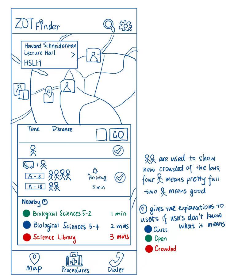
This redesign addresses Maya’s need to quickly find a quiet and comfortable study or waiting space after she arrives on campus, without having to wander around or guess which rooms will be busy. Maya values predictable routines and prefers quiet environments where she can prepare for class, rest, or study between activities. She often arrives early and wants to use that time efficiently, instead of wasting it looking for seat availability.
The part of the sketch that directly addresses this need is the “Nearby” list under the route breakdown, which surfaces study and assembly spaces closest to her destination. Each location shows walking time and a colored status (blue = quiet, green = open, red = crowded), allowing Maya to know immediately whether the space will match her comfort preference. This helps her choose options that match her tolerance for noise and crowd levels without physically checking the spaces herself.
The unique aspect of this design is the color-coded availability system supported by a question-mark explanation icon. The icon helps clarify the meaning of each color for first-time users (quiet, open, crowded), making the design understandable without prior knowledge. With clear color tags, Maya can make decisions instantly and the explanation icon prevents confusion while keeping the interface simple.
This design directly supports Maya’s goals by helping her settle into a suitable, quiet environment quickly, reducing frustration, and maximizing her productivity between classes. It responds to her pains by eliminating the need to “scout” crowded spaces, providing a confident and stress-free way to choose where she wants to be next.
To further explore the redesign of ZotFinder, I created a mobile interactive prototype based on Sketch 2 redesign. The prototype focuses specifically on how users can choose a commuting mode and customize the route according to their safety and comfort needs. The prototype is made for a mobile interface and includes interactive selection elements such as filter buttons, icons, and toggles.
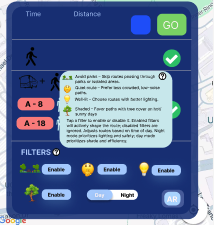
In the prototype, the user can tap the “Enable” filter buttons to specify route preferences such as avoiding parks, selecting quiet or shaded paths, or preferring well-lit options. In addition, the Day/Night mode toggle lets the user switch between daytime and nighttime route preferences. While hovering the questionable mark icon next to the “FILTERS”, it will show up the explanations of the filter feature in case the users don’t know the specific meanings of each little function. This demonstrates how routes may change based on lighting, which helps users like Maya feel safer when traveling at night. The prototype intentionally highlights how route customization can impact both walking paths and bus + walking commutes.
This prototype supports two key tasks that users should be able to accomplish within the current design. One primary task a user can accomplish with this redesign is customizing their route based on personal safety and environmental preferences. By navigating to the “Filters” section within the routing card, a user can actively toggle specific conditions, such as “Well-lit” for safer night travel or “Shaded” for comfort during hot days by tapping the “Enable” buttons. Additionally, the user can instantly adapt the map’s visual interface to their current environment by switching the “Day/Night” toggle, ensuring the navigation remains legible and helpful regardless of the time of day.
A second key task users can perform is assessing real-time transit options to determine the most comfortable and efficient ride. With the current design, a user can glance at the transit section to see exactly when the next bus is arriving and simultaneously evaluate passenger density. By comparing the stick figure icons next to bus A-8 and A-18, where four figures indicate a crowded bus and two indicate a route with available seats, the user can make an informed decision on whether to board the immediately arriving bus or wait for a less crowded alternative. The tasks directly address Maya’s pains of app-juggling and uncertainty by letting her preview safe, comfortable routes within a single interface.